
What Is the Bitcoin Rainbow Chart and How to Use It?
Have you ever wished there was a simpler way to understand Bitcoin's volatile market movements? Imagine being able to quickly determine whether it's the right time to buy, sell, or hold Bitcoin, just by glancing at a colorful chart. Well, that's precisely what the Bitcoin Rainbow Chart offers investors, whether you're brand new to cryptocurrency or an experienced trader. In this article, we'll explore exactly what the Bitcoin Rainbow Chart is, delve into how to interpret its color-coded bands effectively, address common misunderstandings, and provide practical advice to help you make smarter crypto investment decisions.
Understanding the Bitcoin Rainbow Chart
The Bitcoin Rainbow Chart, or Bitcoin Rainbow Price Chart, is a visual representation that simplifies Bitcoin's historical price data into a spectrum of color-coded bands. These colors help investors quickly assess whether Bitcoin is potentially undervalued, fairly valued, or overvalued. Created using logarithmic regression models, it provides investors with an accessible way to interpret Bitcoin’s valuation and identify investment opportunities at a glance.
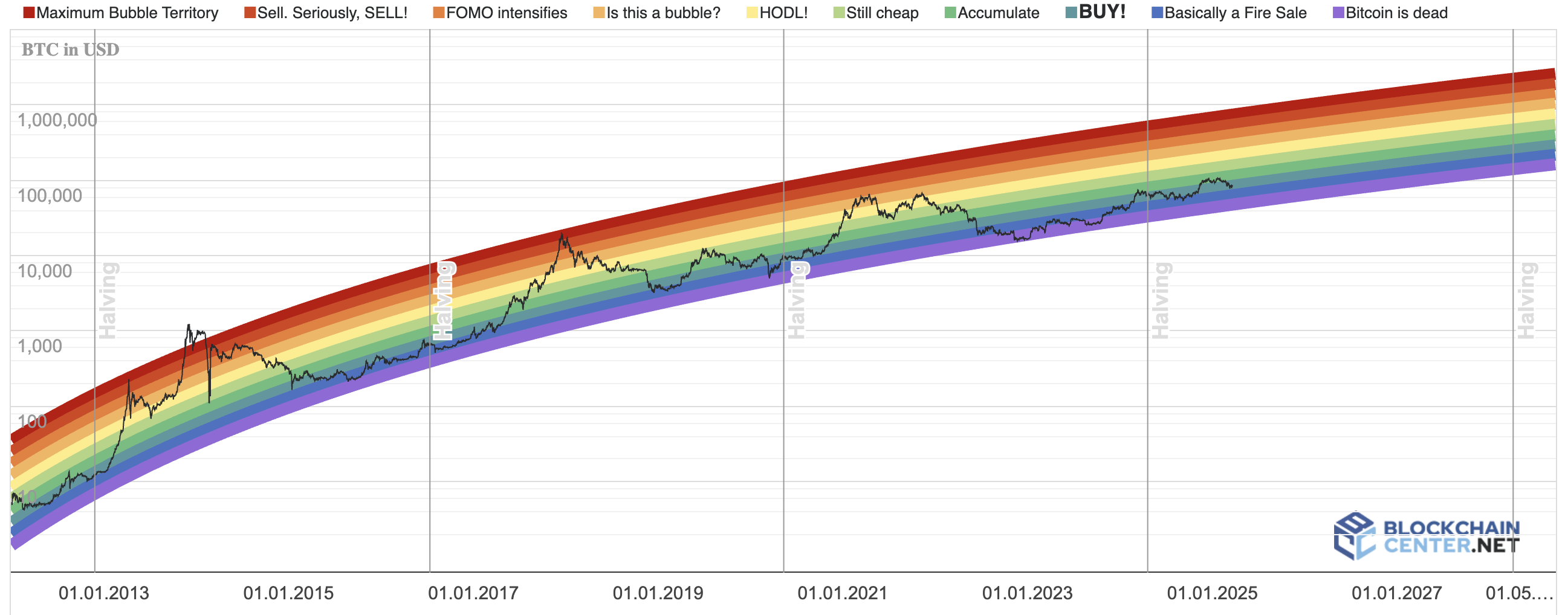
Bitcoin Rainbow Price Chart
Source: blockchaincenter.net
How Was the Bitcoin Rainbow Chart Created?
Initially conceptualized by crypto enthusiasts in 2014, the Bitcoin Rainbow Chart gained popularity as it provided an easy-to-understand visualization of Bitcoin’s historical market behavior. Utilizing logarithmic regression, this chart effectively smooths out price volatility, helping investors identify key valuation levels based on historical price trends. Over time, the Rainbow Chart has become an authoritative resource, widely trusted by investors seeking a reliable method to evaluate market sentiment.
How the Bitcoin Rainbow Chart Works
At its core, the Bitcoin Rainbow Chart categorizes Bitcoin’s historical price levels into various bands, each represented by different colors—ranging from dark blue indicating extreme undervaluation ("Basically a Fire Sale") to dark red signifying extreme overvaluation ("Maximum Bubble Territory"). By visualizing this data logarithmically, the chart smooths out extreme volatility, making it easier for investors to understand Bitcoin’s broader market trends and sentiment.
How to Interpret the Rainbow Chart Color Bands
Each color band of the Bitcoin Rainbow Chart signifies a different market sentiment or valuation level:
-
Dark Blue ("Basically a Fire Sale") and Light Blue ("BUY!"): Ideal moments to purchase Bitcoin as prices are considered extremely undervalued.
-
Green ("Accumulate") and Light Green ("Still Cheap"): Good opportunities to gradually build your Bitcoin holdings.
-
Yellow ("HODL!"): Neutral sentiment, recommending investors hold their existing positions.
-
Orange ("Is this a bubble?"): Prices are potentially inflated, urging caution before making significant investments.
-
Red ("FOMO intensifies") and Dark Red ("Maximum Bubble Territory"): Bitcoin prices are significantly overvalued; investors should consider selling or securing profits to avoid losses from potential market corrections.
How to Use the Bitcoin Rainbow Chart for Crypto Investing
Using the Bitcoin Rainbow Chart effectively requires combining its insights with sound investment strategies. Here's how you can practically apply the chart to your crypto investment:
Finding Optimal Buying Times
When Bitcoin’s price falls into the dark blue or light blue bands, historically, these have proven to be strong entry points for long-term investors. For instance, during the 2018 crypto winter, the chart indicated Bitcoin prices within the "Basically a Fire Sale" zone, around $3,000-$4,000. Investors who followed the chart’s signals and bought at these low valuations later benefited greatly when Bitcoin prices surged in subsequent years.
Recognizing When to Sell
When Bitcoin enters the upper bands like red or dark red, market sentiment is indicating overvaluation. An example occurred during Bitcoin’s price peak in late 2017 and again in 2021, where the price hit the "Maximum Bubble Territory" band around $19,500 and $64,000 respectively. Investors who took profits in these scenarios maximized their returns and avoided substantial losses during corrections.
Refining Dollar-Cost Averaging (DCA) Strategies
The Bitcoin Rainbow Chart also enhances your DCA approach. Investors may increase their buying frequency or investment amount when Bitcoin prices dip into "Accumulate" or "Still Cheap" bands and reduce their investment during higher-risk orange and red bands, effectively optimizing their overall portfolio costs.
Common Issues Investors Encounter with the Bitcoin Rainbow Chart
While helpful, the Bitcoin Rainbow Chart is not without potential challenges:
Overdependence on Historical Data
One common mistake is assuming past trends guarantee future results. Although historical price behavior can guide investment choices, Bitcoin remains susceptible to unpredictable market conditions, regulatory changes, or global economic events.
Solution: Always combine insights from the Rainbow Chart with fundamental and technical analysis. Platforms like Bitget offer robust trading tools and detailed market analyses to support informed decisions.
Misunderstanding Color Band Meanings
Another common issue is misunderstanding the significance of each color band, leading to incorrect investment actions. For instance, new investors might mistakenly panic-sell when Bitcoin reaches the yellow "HODL" zone, misunderstanding its neutral stance as a negative indicator.
Solution: Familiarize yourself thoroughly with each band’s meaning, and ensure you cross-reference multiple sources of market sentiment before making major investment decisions.
Ignoring Short-Term Market Volatility
The Rainbow Chart is most effective as a long-term trend indicator. Short-term traders might mistakenly use it for day trading, resulting in flawed strategies and potential losses due to volatile price swings.
Solution: Clearly define your investment timeframe. Combine the Rainbow Chart with short-term indicators, such as moving averages or RSI, for comprehensive trading strategies.
Practical Advice for Maximizing Your Bitcoin Investments Using the Rainbow Chart
To fully leverage the Bitcoin Rainbow Chart, consider these actionable tips:
Combine with Technical Indicators
Confirm Rainbow Chart signals with other indicators like the Relative Strength Index (RSI) or Moving Averages. For instance, if Bitcoin enters the blue "BUY!" zone, and RSI simultaneously indicates oversold conditions, this strengthens your buying decision.
Stay Updated with Market News
Monitor cryptocurrency news, particularly regarding regulatory updates, technological advancements, or significant global events. These factors can significantly impact Bitcoin’s market valuation independently of historical trends.
Diversify Your Investments
Even when relying on the Rainbow Chart, diversify your investments across various cryptocurrencies. Platforms like Bitget facilitate easy diversification and help manage overall investment risk effectively.
Frequently Asked Questions (FAQs)
Is the Bitcoin rainbow chart accurate?
The Bitcoin Rainbow Chart offers valuable insights based on historical data but should not be used alone for precise predictions. Combine it with comprehensive market analyses for the best results.
Does the Bitcoin Rainbow Chart apply to other cryptocurrencies?
Currently, the Bitcoin Rainbow Chart specifically reflects Bitcoin’s historical data. While similar charts might exist for other cryptocurrencies, this particular chart is tailored uniquely to Bitcoin.
Can beginners effectively use the Bitcoin Rainbow Chart?
Absolutely. Its simple, visual nature makes it beginner-friendly. However, new investors should take time to understand its limitations and complement it with further market research.
Conclusion
The Bitcoin Rainbow Chart serves as a powerful, user-friendly tool for simplifying crypto investing decisions, enabling investors to quickly interpret market sentiment and identify optimal buying or selling points. By combining the insights from the Rainbow Chart with careful analysis, comprehensive market information, and prudent investment strategies, you can confidently navigate the cryptocurrency landscape, turning its volatility into profitable opportunities.
Feeling ready? Register now and explore the wonderful crypto world at Bitget!
Disclaimer: The opinions expressed in this article are for informational purposes only. This article does not constitute an endorsement of any of the products and services discussed or investment, financial, or trading guidance. Qualified professionals should be consulted prior to making financial decisions.